
The business card becomes a showcase
Atoll
21.10.2025
In its fifth year of existence, Atoll is launching a revamped website.
We would like to introduce the new design, but also bid a fitting farewell to the old one, which has served its purpose to the full.
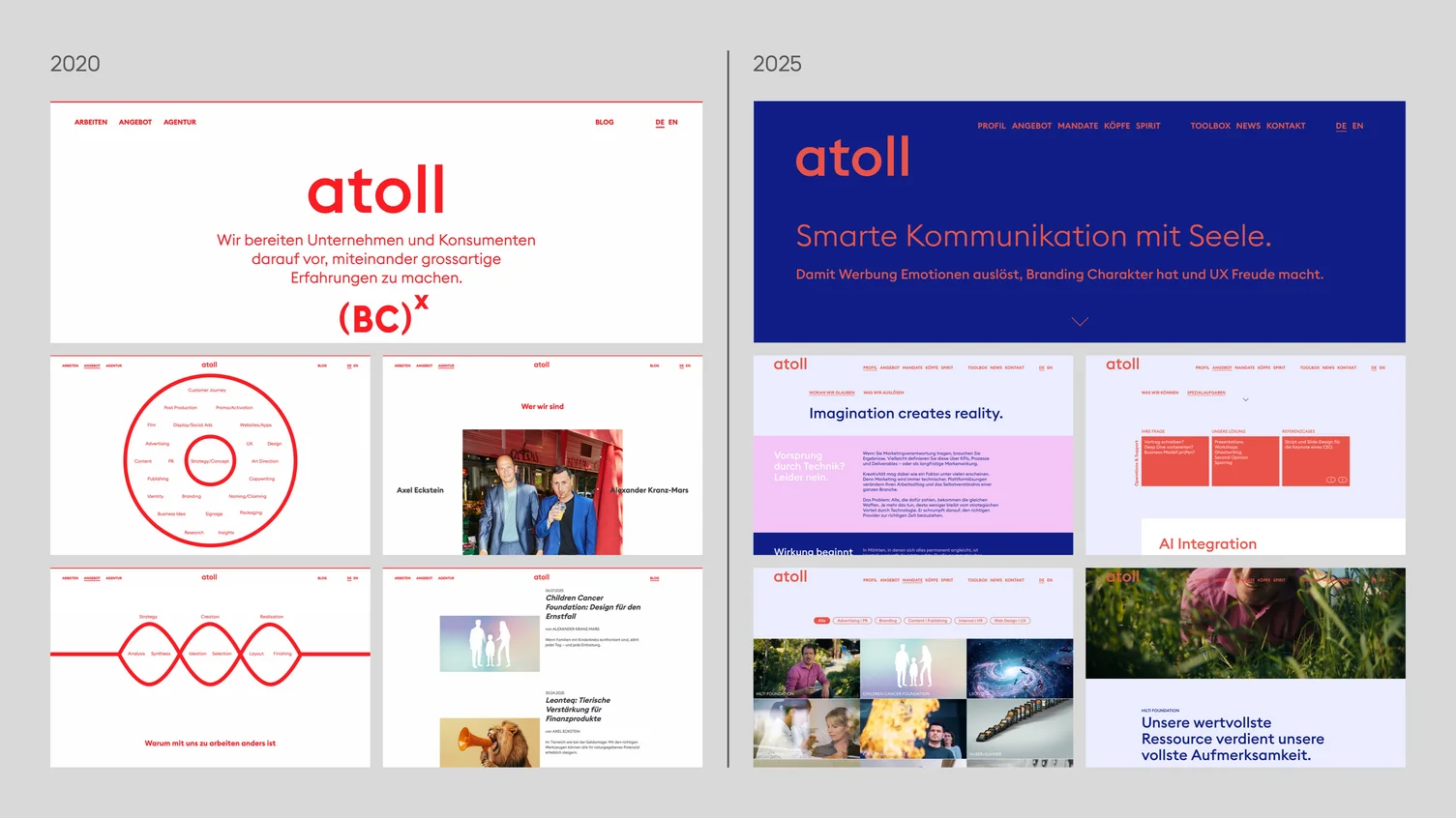
Back when we set up the agency, we decided to show little more than red text on a white background – so almost no images at all.
The radical simplicity of our first website was no accident. Although Alex and Axel had loads of case studies from before Atoll in their portfolio, which represented us as individuals, they naturally did not represent our new agency.
We therefore chose a typeface capable of carrying the design almost single-handedly, making the text appear even more incisive and thus helping to best express the essence of Atoll.
With its curves cut off at right angles, Euclid Square by Swiss Typefaces creates a powerful, resolute impression without ever coming across as stubborn or aggressive. Swiss precision, intellectual insight, maximum clarity, a calming sense of order, absolute reliability – that’s exactly how we work.
The projects we’d accumulated over the agency’s first five years made a redesign of our website seem increasingly urgent, and we began the planning process in June 2025.
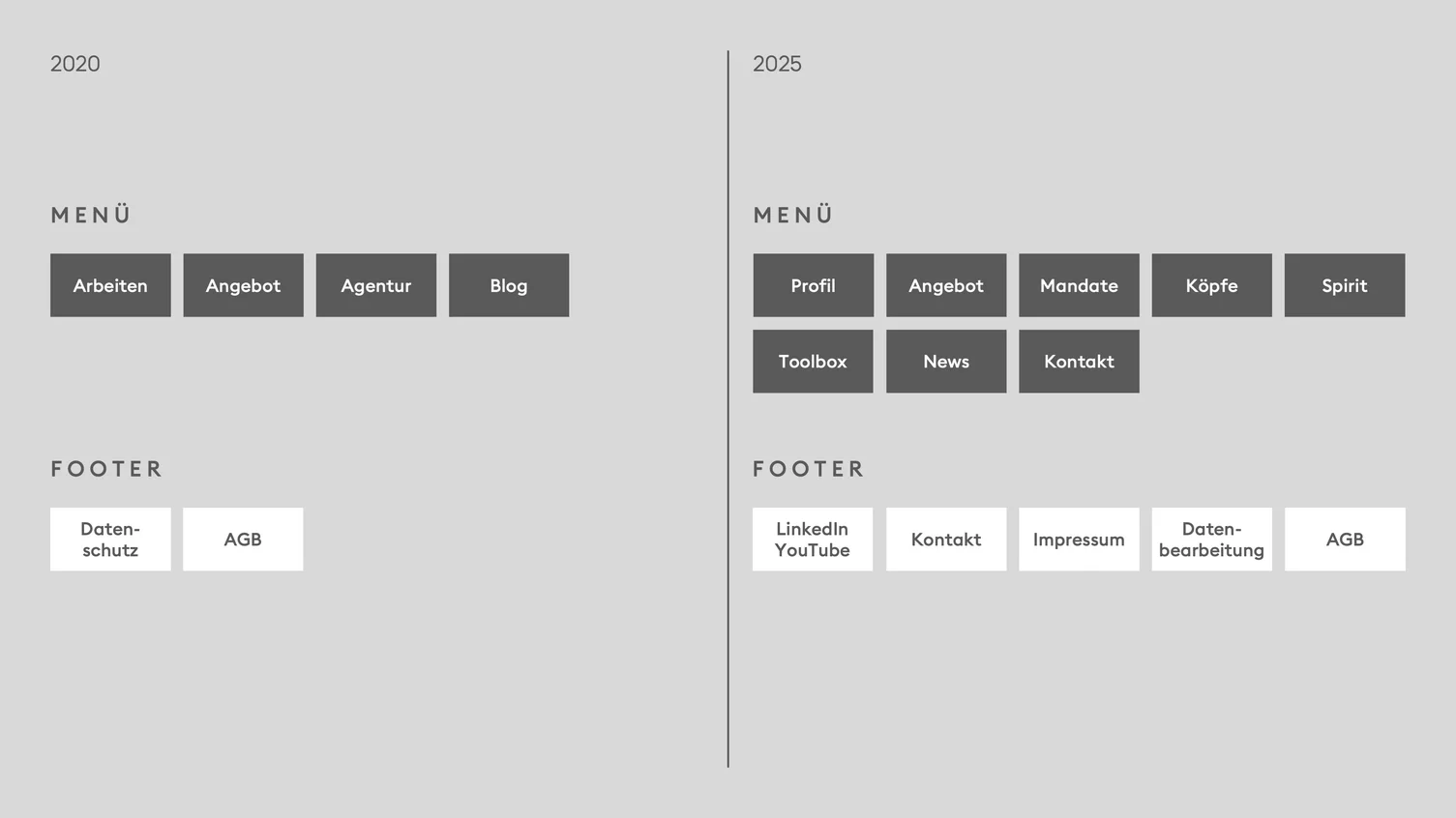
It was clear to us that an agency’s output is its most important ‘reason to believe’, and that our work needed to be showcased more comprehensively and directly.
At the same time, we wanted the website’s structure to reflect the key ‘buyer journey’. We consistently thought from the perspective of marketing managers in order to answer as many of their potential questions as possible when evaluating agency partners.
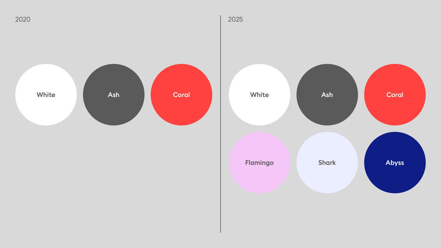
We also put the red and white colour combination to the test. We harmoniously expanded it to include shades of blue and violet, so that information can be presented in finer gradations.
As with our first website, animated elements help to create the impression of a modern, fluid user experience. However, it’s all about striking the right balance here. If you overdo the animation, it can quickly veer into the pointless or even annoying.
Many agencies present their work on a project-by-project basis. A tile for the new campaign for client X. A tile for the new magazine for client Y. We do that too – on our new website under ‘News’.
In addition, we group all projects for a single client together under ‘Mandates’. In doing so, we aim to emphasise our commitment to always developing individual projects as pieces of a larger brand image.
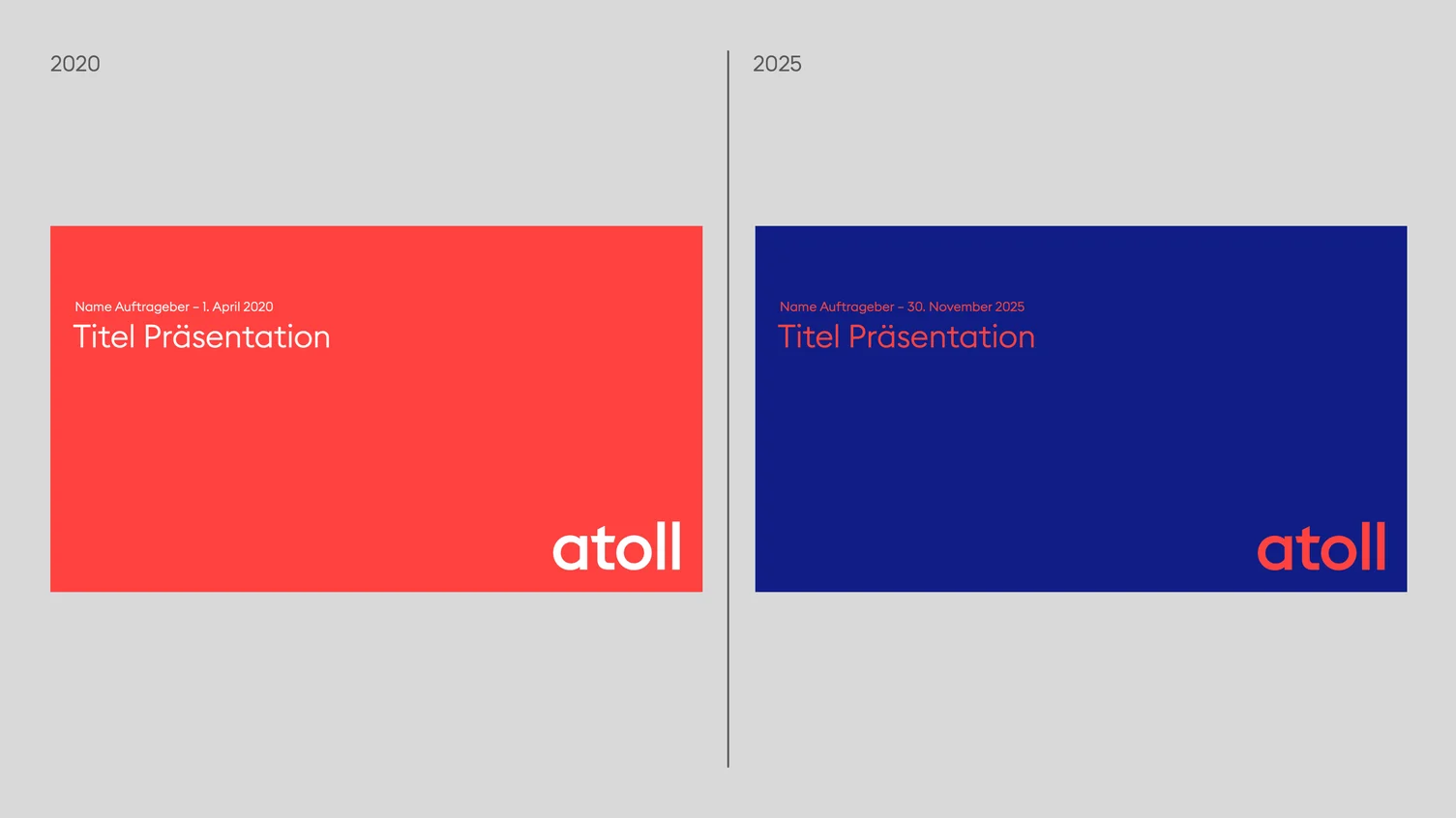
The redesign of our website has been the epicentre of a wave that has spilled over into our PowerPoint templates. We changed the colour scheme of the title slides from white-on-red to red-on-blue.
We’re far from saying goodbye to the Euclid font just yet. It has so much character that we’ll probably have a few more years together.